How to Trade with Long Wick Candles

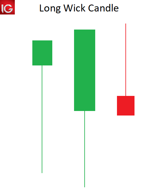
Long Wicks Can Provide Valuable Trading Signals

Long wick candles are recurrent within the forex market. This makes understanding the meaning behind these candles invaluable to any trader to comprehend the market dynamics during a specific period.

Trading candle wicks is often overlooked due to its simplicity but appreciating this concept can be a great addition to a trader’s repertoire. This article will outline:

  • What are long wick candles?
  • How to identify a long wick candle on forex charts
  • What does a long wick tell us in forex?

What are long wick candles?

Long wick candles are type of candlestick that have a long wick attached to the candle body. The candle body can be positive or negative, making the long wick appropriate for any type of candlestick.

The length of the candle wick specifies the high and low of price movement within a designated time period. Understanding and trading candlestick wicks can provide forex traders with key tradeable opportunities.

long wicks candle

How to identify a long wick candle on forex charts

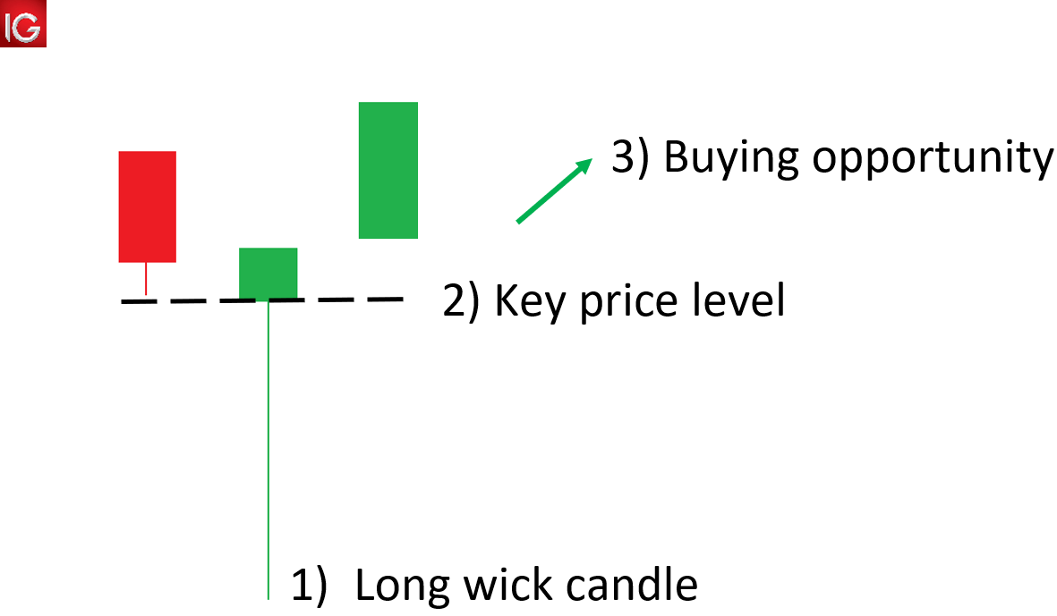
  1. Locate long wicks above/below a candle that is disproportionately longer than that of the surrounding wicks.
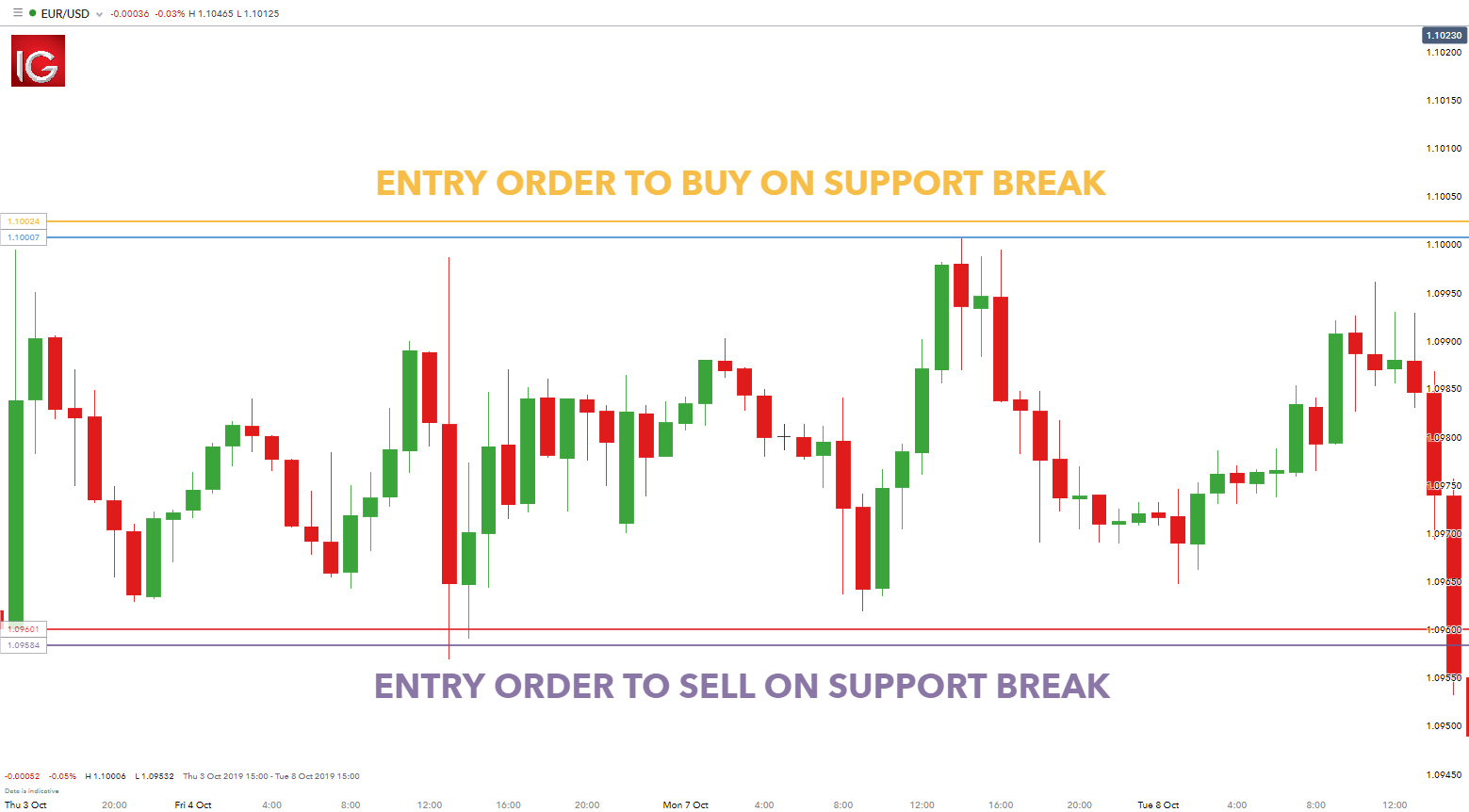
  2. Use price action to identify key price levels that may coincide with the long wick, signalling levels of support/resistance.
  3. Use the long wicks and key levels to detect potential trade opportunities.

identifying the long wick candle

What does a long wick indicate in forex?

A long wick candle, like shooting stars, gravestone Doji’s and hammers are part of a “family” of reversal candlesticks. Let’s explore an example:

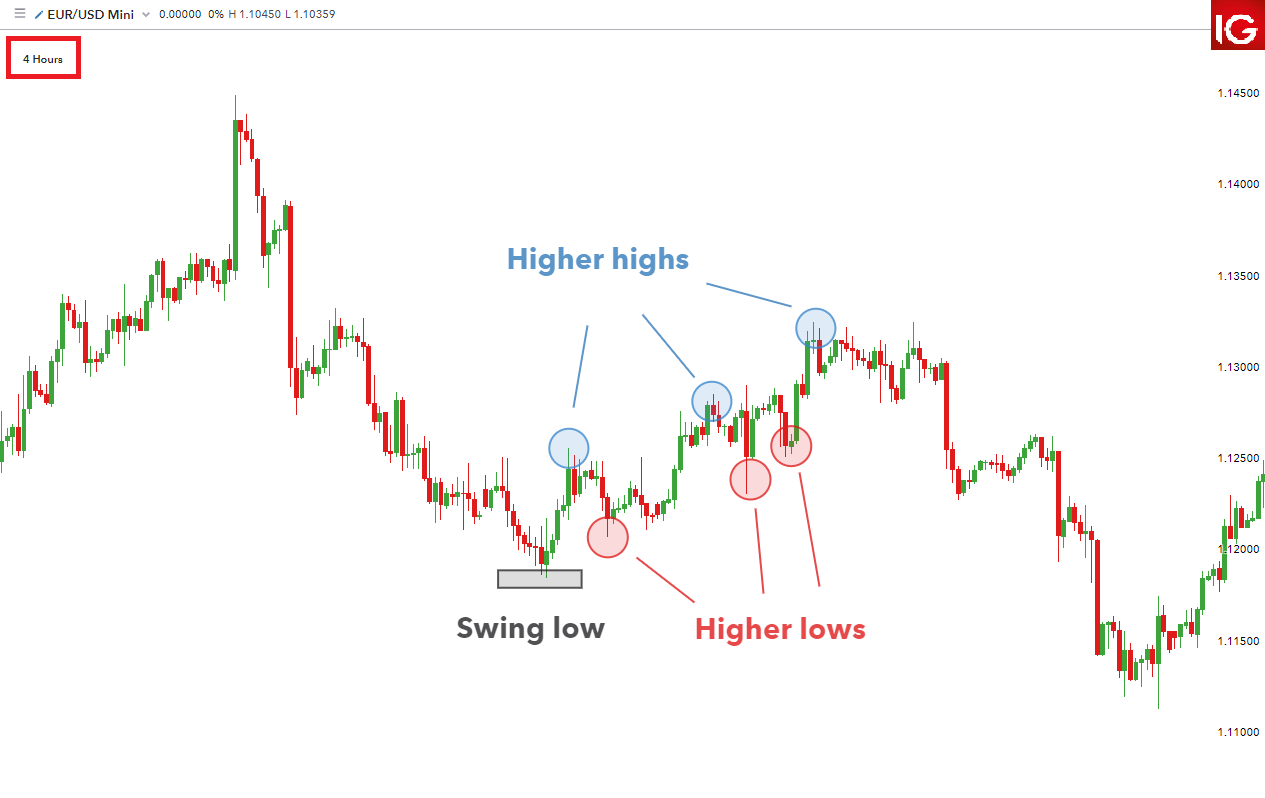
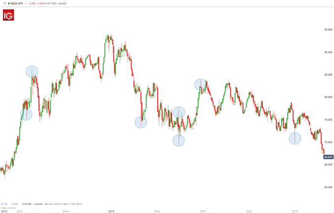
NZD/JPY Long Wick Candles

The chart below shows NZD/JPY on a weekly time frame. Highlighted in blue illustrates long candle wicks prior to a reversal in price movement. In other words, if the longer wick is below the body of the candle, price tends to move up.

Conversely, if the longer wick is above the body of the candle, price tends to move down. These extended wicks (those that are longer relative to other wicks on the chart) provide valuable information for the trader.

trading the long wick candle

A long wick that extends below a candle signifies that sellers were able to push the price down significantly. However, bulls were able to drive price back up showing buyers strength. Since bulls overpowered the selling pressure by bears, there exists the potential that their strength will carry forward leading to an upwards movement in price. The same principal would apply for long wicks appearing above the candle – in the opposite direction.

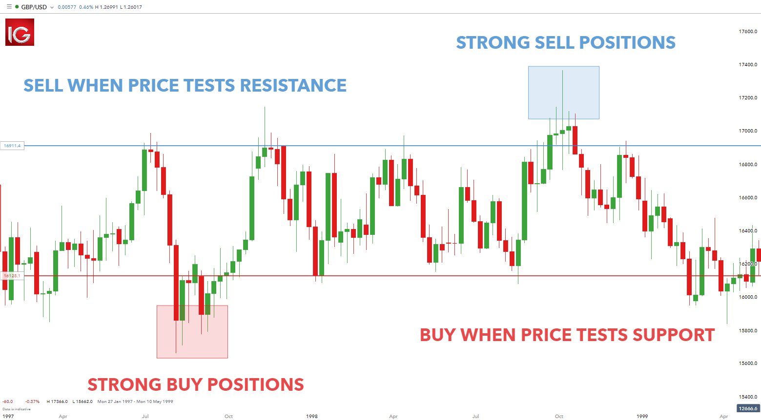
How can a trader use long wicks in their trading

The first step when utilizing long wicks is to identify the trend (as mentioned above). If the trend is down, seeing a candle (or several candles) with long wicks on the top points to a stronger potential for price to move down in the direction of the market.

Continuing with the downtrend example, if the pair retraces (moves against the trend) and stalls at a level of resistance or a Fibonacci level, traders will look for long wicks at the tops of the candles forming along that resistance line for two reasons:

  1. Those long wicks indicate the potential for the pair to trade to the downside back in the direction of the trend.
  2. The top of that extended wick provides a very prudent level for a trader to place their stop. The rationale for that stop placement being that buyers pushed price to the top of that wick but could not push it beyond that point. Hence, placing the stop just above that wick is a level that has a lower likelihood of getting hit.

There is often confusion amongst traders as to which time frame of chart this strategy can be applied to. For day traders, they may look at 5- or 10-min time frame charts. Swing traders on the other hand may look at other intraday charts like 2-hour or 4-hour charts.

Are you keen to learn about different trading strategies? Learn more about the top 8 forex trading strategies

Taking note of long wicks forming at levels of support or resistance, especially when they signal movement in the direction of the daily trend, can create a beneficial “edge” for the trader.

Advantages and Limitations of the Long Wick Candle

Advantages Limitations
Appears frequently in all financial markets Cannot be traded using the long wick candle in isolation
Long wicks are easy to identify Require supporting evidence to trade such as key price levels or indicators

Further reading on forex candlestick patterns

  1. Rising wedge and falling wedge patterns
  2. Head and shoulders
  3. Double top
  4. Double bottom
  5. Inside Bar

Gold Trading: Three Top Tips for Trading Gold

Gold Trading Tips

Few markets on Earth have the historical appeal and attraction as Gold. While traders have numerous trading options today, in a number of different currencies or asset classes or geographies, Gold has been a long-standing store of value that’s piqued speculators’ interest for about as long as human beings have traded with each other.

We previously looked at some of the basics around Gold trading in the What is Gold article a little earlier in this sub-module. And we also have a ‘How to Trade Gold’ article on the Gold page of DailyFX. But, in this article, we’re going to get a bit more granular as we investigate Gold Trading Strategies, Tips and Tactics.

Gold Trading Tips

Probably one of the more obvious aspects of Gold, particularly on a longer-term basis, is the cycle sensitivity that will often show around the metal – and this isn’t a new phenomenon. As markets themselves are cyclical animals, Gold often moves to a similar type of tune, although timing may be differentiated from other markets at the time. Looking at Gold prices over the past 45 years, and this becomes a bit more clear. On the below chart, trends and ranges have been identified by blue or grey boxes, and that leads us into tip number one:

Gold Trading Tip #1: Adapt to the Present Condition

The key takeaway here is the importance of adaptation: Because if a trend trader approaches Gold with their typical approach while Gold markets are in a range, there’s high odds they could see unfavorable results. If Gold markets are mean-reverting and range-bound, the trader would likely want to approach the matter with a range-based approach. But, when Gold markets are trending, such as the case from 2001-2011 or 1976-1980, then traders are going to want to utilize trend strategies to adapt to the present condition.

Gold Futures Monthly Chart

Gold Trading Tip #2: Watch the US Dollar

The US Dollar is traded in a number of markets but, in the largest venues, Gold is traded in US Dollars. As a matter of fact, one common equation on CFD platforms presents a quote for Gold prices as ‘XAU/USD.’ The chemical symbol for Gold on the periodic table of elements is ‘AU’ and the denominator in that quote is the US Dollar, highlighting how Gold is being priced in terms of US Dollars.

This also means that, all factors held equal, and if Gold made no move at all but the US Dollar increased in value – the price of Gold could go down. Because in the function above, the value of the denominator, or USD, would increase in value thereby decreasing the value of the function as a whole.

So, there could be a tendency for Gold to display an inverse correlation with the US Dollar. This isn’t all of the time, there are scenarios where both Gold and the Dollar may increase in value although those are somewhat rare, historically speaking.

On the below chart, that correlation is highlighted in the bottom portion of the image. Reads or values above the zero line indicate positive correlation which, again, is somewhat rare but not unheard of. Reads below zero highlight inverse correlation, with a value of -1 highlighting a perfect inverse relationship.

Gold Monthly Price Chart: An Inverse Relationship with the US Dollar

Gold Trading Tip #3: Know Your Time Frames

On the above charts we’re looking at the bigger picture behind Gold prices using the Monthly variety. But these conditions and market changes can take place on shorter-terms, as well, and it’s key for traders to have some type of consistent framework for their analysis so that they can properly implement their strategies in the ways that they want.

As we looked at in the multiple time frames article, traders should analyze markets from more than a single vantage point. The above monthly variety can be helpful to see the bigger picture – but for actually setting up trades and implementing strategies, traders will likely want to look to shorter time frames.

In the above graphic, the blue box on the right side of the chart shows a trend that’s been going for a little over two years now. But, looking at the shorter-term daily chart below to get a more granular look at that two-year-outlay shows that Gold prices were not trending the entire time. As a matter of fact, the same type of trend-range-trend-range relationship presented itself inside of this longer-term trend.

This is again important for traders when setting up strategy because for those that are looking to trade a trend, waiting for the monthly chart to highlight that potential may be too late. On the below chart, that blue box has been expanded so we can take a more granular look at the trend; but this time, I’ve added green boxes around the shorter-term trends and grey boxes around the mean-reverting or range-bound periods.

Gold Daily Price Chart

Gold Trading Strategies

Perhaps more important than the specific strategy that one is using to analyze or set up trades in Gold is the ‘fit’ to that specific market condition. For instance, if we look at the above image and focus on the green boxes, when the short-term trend is moving in the direction of the longer-term trend, traders are going to want to follow the age-old adage of ‘buying low and selling high.’ In the grey portions, however, when prices are ranging, traders want to similarly buy low and sell high but they’re going to want to do that in a slightly different way; closing the entirety of the long position while ‘high’ and then looking at potentially getting short to play the other side of the range.

Right up front – this means that no trader is always going to be ‘right’ because conditions, similar to trends, will change; and its impossible to know that until after the fact. This is where items like trade and risk management come into play, potentially helping to mitigate the downside in those instances where something changes or shifts away from their expectations.

Simplifying Market Behaviors by Assigning ‘Conditions’

With any market, if you think about it, there’s really only a couple of things that prices might do: Trend or not. Either prices are trending in a directional move for some reason, or they’re not trending at all: And the transitory state between mean-reversion and trends are breakouts, which are technically a market condition, itself. So, in that effort of simplification, analysts can break down market conditions into three specific types:

  1. Trend – a directional move is showing and there’s often a fundamental reason for it as traders are bidding higher-highs and higher-lows (or selling lower-lows and lower-highs).
  2. Range/Mean-Reversion – devoid of a driver, prices will often display no trend, which can open the door for range-bound or mean-reversion strategies.
  3. Breakouts – this is what happens when new information gets priced-in, and this can create a breakout move from a range and into a new trend. That new trend may last for a while or it may merely propel price action into a new range.

Bespoke Approach for the Proper Condition

Knowing what state a market is in isn’t enough, as traders are usually going to want to cater their approach to that specific condition. For instance, a trader focusing on breakouts likely won’t be able to withstand as much excursion as a trader picking on range/mean reversion setups.

At DailyFX, we help traders learn more about strategies for each of these conditions. But, perhaps the most important aspect of customizing a strategy to a specific traders’ needs is the risk management component, which is explored in-depth our Traits of Successful Traders research series, which is available completely free-of-charge and can be accessed by clicking on the link below:

Pound Sterling Latest: GBP/USD Attempts Come Back Post-FOMC Sell-off

Post FOMC Rebound on the Cards for GBP/USD?

The daily GBP/USD chart reveals an attempt to lift off the stern zone of support found at the 200-day simple moving average and the 1.2585 level that help up prices for large parts of early 2024 when prices exhibited a range-bound preference.

Since spiking above the prior range, not for the first time either, GBP/USD heads back into familiar territory as the pair looks to recover from the sharp decline. 1.2736 is the next level of resistance should bulls take over from here. Sterling stands to benefit from a slightly weaker dollar at the start of the holiday-shortened week which also happens to be very quiet from a scheduled risk point of view with just PCE data scheduled for release on Good Friday.

GBP/USD Daily Chart

image1.png

GBP/USD:Retail trader data shows 59.14% of traders are net-long with the ratio of traders long to short at 1.45 to 1.

We typically take a contrarian view to crowd sentiment, and the fact traders are net-long suggests GBP/USD prices may continue to fall.

Read the detailed GBP/USD sentiment report to find out why recent changes in positioning has clouded the outlook for the pair from a contrarian view point.

Positioning is less net-long than yesterday but more net-long from last week. The combination of current sentiment and recent changes gives us a further mixed GBP/USD trading bias.


Bitcoin (BTC) Eyes New All-Time High, Ethereum (ETH) Trails, Coinbase (COIN) Rallies

Bitcoin has rallied by around 12% since Sunday’s opening print as demand for the largest cryptocurrency by market cap continues to increase prices. A technical, bullish, break of a short-term descending channel now suggests that Bitcoin will attempt to make a fresh record high in the near-term and likely ahead of next month’s halving event. Any pullbacks will find initial support around $69k before just under $65k comes into focus. The Average True Range (ATR) reading is at a multi-month high, while the CCI indicator shows Bitcoin nearing overbought territory. The chart set-up suggests Bitcoin will move higher over the coming days but a short-term turn lower cannot be discounted.

Bitcoin Halving Event

Bitcoin Daily Price Chart

image1.png

Ethereum is also pushing higher but continues to lag Bitcoin. While Bitcoin has already made a new ATH, Ethereum remains around 30% its peak and is struggling to regain its mid-March multi-month high of around $4,100. The proposed Ethereum spot ETFs look like they will not be approved by May 23rd – the Van Eck ETF deadline date – and this is weighing on the cash Ethereum price. With the ETF potential approval being pushed further out, Ethereum may struggle to match Bitcoin’s performance over the coming weeks. Any further move higher will likely be kept in check by the mid-March high.

Ethereum Daily Price Chart

image2.png

Coinbase (COIN), the largest cryptocurrency exchange in the US continues to benefit from the increased interest, and turnover, in the space. Coinbase shares are back at highs last seen in December 2021 and remain a proxy for overall crypto-market performance. Coinbase is trading around the 61.8% Fibonacci retracement of the May 2021 – January 2023 sell-off and targets the 78.6% retracement level at $343. Support on the weekly chart is seen at the 50% retracement level at $230.

Coinbase Weekly Price Chart


image3.png


Time Frames of Forex Trading: A Beginner’s Guide

Utilizing different forex time frames can assist traders to spot the larger trends and more granular price action that may be unfolding. Different viewpoints can be formed when switching between different time frames on the same currency pair and this can either benefit or hinder the analysis. Therefore, it is crucial to have a solid understanding of forex trading time frames from the very first trade.

This is a beginner’s guide that introduces the concept of forex time frames, their challenges, why they are useful, and how they can be implemented.

What are the main forex time frames?

Forex trading time frames are commonly classified as long-term, medium-term and short-term. Traders have the option of incorporating all three, or simply using one longer and one shorter time frame when analyzing potential trades. While the longer time frames are beneficial for identifying a trade set up, the shorter time frames are useful for timing entries.

Forex time frames

Classification Trading Style Trend Time Frame Trigger Time Frame
Long term Position trading Weekly Daily
Medium term Swing trader Daily 4-hour
Short term Day trading 4-hour Hourly
Scalper Hourly 15-minute

How does time frame analysis impact forex trades?

Switching between different forex trading time frames has a number of advantages. These become apparent when viewing forex vs stocks. Due to the sheer liquidity of the forex market, traders can view very short time frames and observe meaningful information whereas, a similar time frame for an illiquid stock may not present any new data points if the price has not changed.

Another advantage in favor of forex time frames includes the 24-hour nature of the forex market during the week. Switching between multiple forex time frames during different trading sessions (Asian, European, US) presents traders with different market conditions that are characteristic to that trading session like ranging markets during the Asia session or trending markets during the European and US session cross over. Traders can capitalize on these different market characteristics by using various time frames to spot ideal entries.

What forex time frame should be traded?

Many traders new to forex will often wonder if there is a time frame that is better to trade than another. Fundamentally, choosing the best time frame to trade forex will depend greatly on a trader’s preferred trading style and strategies used.

To choose the best time frame, consider what your trading style is and what trading strategy you wish to follow. These should influence the appropriate time frame to be trading on. Thereafter, select a technical analysis chart that you are comfortable with, conduct thorough analysis, and ensure to implement sound risk management on all trades.

Using forex time frames that match trading strategies

Often, traders can get conflicting views of a currency pair by examining different time frames. For example, while the daily chart might be showing an up-trend, the hourly chart can be showing a down-trend. But which way should it be traded?

This confusion can produce counter-productive unrest in the trader’s mind when attempting to line up trades. Therefore, it’s important for traders to plan the time frames they wish to trade in accordance with their trading strategy.

Swing trading example

A swing trader adhering to a trend following strategy should avoid making rash decisions when viewing price movements on smaller time frame charts. Traders may observe what looks like a trend reversal on a shorter time frame chart. However, after viewing the daily chart, it is clear to see the trend is still well intact.

Four-hour EUR/USD chart providing misleading signals suggesting a trend reversal

4-hour time frame chart showing misleading signals

Incorporating a longer time frame allows traders to see a ‘bigger picture’ of the currency pair, to get an idea of general trends, or the sentiment that may exist; while the shorter time frame chart can be used for timing entries into the market.

Therefore, looking at the daily chart, it is clear to see that the downtrend is clearly still in force when observing the correct time frame.

Daily EUR/USD chart: Showing a clear trend continuation lower

Daily time frame showing down trend still intact

Traders should adopt multiple time frame analysis to incorporate as much information as possible into the analysis – without overcomplicating the analysis.

The beauty of this approach is that technical analysis can be applied on both time frames to achieve greater conviction for the trade.

The Most Volatile Currency Pairs and How to Trade Them

Currency volatility, often measured by calculating the standard deviation or variance of currency price movements, gives traders an idea of how much a currency might move relative to its average over a given time period. Traders can also gauge volatility by looking at a currency pair’s average true range or by looking at range as percent of spot.

The higher the level of currency volatility, the higher the degree of risk, and vice versa. Volatility and risk are usually used as interchangeable terms.Different currency pairs have different levels of volatility on average.

Some traders enjoy the higher potential rewards that come with trading volatile currency pairs. Although, this increased potential reward does present a greater risk, so traders should consider reducing their position sizes when trading highly volatile currency pairs.

What are the most volatile currency pairs?

The most volatile major currency pairs are:

Most Volatile Currency Pairs

Other major currency pairs, like EUR/USD, USD/JPY, GBP/USD and USD/CHF, are generally more liquid and less volatile as a result. That said, emerging market currency pairs, such as USD/ZAR, USD/TRY and USD/MXN, can clock some of the highest volatility readings.

MOST VOLATILE CURRENCY PAIRS

Majors – AUD/JPY, NZD/JPY, AUD/USD, CAD/JPY, GBP/AUD

Emerging Markets – USD/ZAR, USD/TRY, USD/MXN

Aside from relatively low liquidity, emerging market currencies tend to be highly volatile in particular due to inherent risk underpinning emerging market economies. The chart below gives an example of how volatile emerging market currencies can be, which shows USD/ZAR (US Dollar/South Africa Rand) exploding nearly 25% higher in just over a month’s time. There are several other examples of emerging market currency pairs swinging drastically like this throughout history.

USDZAR Daily Price Chart

What about the least volatile currency pairs?

The least volatile currency pairs tend to be the major currency pairs which are also the most liquid. Also, these economies tend to be larger and more developed. This attracts more trading volume and facilitates greater price stability in turn. To that end, considering EUR/USD, USD/CHF and EUR/GBP trade with high volumes of liquidity, it comes as little surprise they are among the lease volatile currency pairs.

Illustrated below, the average true range (ATR) on USD/CHF ranges between 45-pips and 65-pips, a low average true range compared to other pairs. The average true range of a currency is one of the many ways to measure the volatility of a currency pair. Bollinger Band width is another popular technical indicator used to measure volatility.

USDCHF Daily Price Chart

Correlation between two currencies can also have an impact on their volatility. The more positively two currencies are correlated to one another might lead to less volatility. Continuing with our USD/CHF example, we note that the US Dollar and Swiss Franc are both viewed as safe-haven currencies.

The US Dollar and Swiss Franc tend to strengthen against their sentiment-linked peers when the market experiences episodes of risk aversion, but the two currencies may not deviate much from each other. This contributes to relatively low volatility readings for USD/CHF.

How to trade currency pair volatility

Forex traders should take into account current readings of volatility and potential changes in volatility when trading. Market participants should also consider adjusting their position sizes with respect to how volatile a currency pair is. Trading a volatile currency pair might warrant a reduced position size.

Awareness of volatility can also help traders determine appropriate levels for stop loss and take profit limit orders. Furthermore, it is important to understand the key characteristics separating the most volatile currencies from currencies with low volatility readings. Traders should also know how to measure volatility and have an awareness of events that might create big changes in volatility.

The difference between trading currency pairs with high volatility versus low volatility

  1. Currencies with high volatility will normally move more pips over a certain period than currencies with low volatility. This leads to increased risk when trading currency pairs with high volatility.
  2. Currencies with high volatility are more prone to slippage than currency pairs with low volatility.
  3. Due to high-volatility currency pairs making bigger moves, you should determine the correct position size to take when trading them.

Supply and Demand vs Support and Resistance

The difference between supply and demand vs support and resistance

Support and resistance is a level where traders see a lot of failed attempts at which price cannot surpass – this idea is familiar to most traders. Supply and demand is a much deeper zone that represents regions of key price levels of broad support and resistance.

Supply and Demand Support and Resistance
Represented by a broad price region Defined by a key price level
Easier to find trade entries More difficult to base trade decisions

How to use support and resistance to trade supply and demand

Trading Supply and Demand

The first thing traders need to do before placing a trade based on supply and demand is to decide whether the environment is expected to stay the same or to rapidly change. This can be assessed by market volatility measures such as significant political strife or economic news. This is the dichotomy between the decision to trade for a range or trade for a breakout.

Trading the Range

When trading a range, traders are anticipating the environment to stay about the same; with support or resistance standing its ground allowing for traders to ‘buy low,’ and ‘sell high’. The chart below illustrates how a trader can use price alone to identify those points in the market at which demand begins to outstrip supply (creating increased prices) or supply begins to overrun demand (creating decreased prices).

Trading the range with a GBP/USD chart

trading the range with support and resistance

Trading the Breakout

The other side of the coin is the trader that is expecting the environment to change, with breaks of support or resistance to create new highs or new lows.

With this style, the trader’s objective changes from the range-bound condition. The goal is now to ‘buy high, and sell back at a higher price,’ or to ‘sell low and buy back to cover at a lower price.’

 Trading the breakout with a EUR/USD chart

trading the breakout with supply and demand

Since these environments can be considerably more chaotic than what might be expected in ‘ranging’ markets, traders are usually best served by altering the risk management condition to account for the increased risk of trading in a rapid market. For more information, read our guide to forex risk management techniques.

Trading with the Cup and Handle Pattern

What is a cup and handle pattern and how does it work?

The cup and handle pattern is a continuation pattern that occurs after a preceding bullish or bearish trend. This formation provides traders with some distinctive features. The ‘cup and handle’ term translates to the bar chart pattern. The cup presents as a bowl shape whilst the handle is depicted as a downward slanting period of consolidation.

cup and handle pattern

How to identify a Cup and Handle Pattern

The cup and handle pattern is slightly more complex as opposed to other chart patterns which can be tricky for some traders to identify. The steps below outline a simple guide to identify the cup and handle chart pattern successfully:

  1. The cup and handle pattern is considered to be a bullish continuation pattern therefore, identifying a prior uptrend is essential. This can be done using price action techniques or technical indicators such as the moving average.
  2. The cup should form more of a ‘U’ shape as opposed to a ‘V’ with the high points on either side of the cup being approximately even.
  3. The handle resembles a consolidation generally in the form of a flag or pennant pattern. This should be downward sloping but does consolidate sideways in some instances similar to a rectangle pattern.
  4. The breakout signal can occur in different ways depending on the trader’s preference. Some trader’s look at the resistance level taken from the horizontal between the highs of the cup. Once this breaks that level, entry will be confirmed. Other traders use a break of the handle trendline as a long entry point.

identifying the cup and handle pattern

How to trade with the Cup and Handle Pattern

Trading with the cup and handle pattern differs slightly when using it to trade forex and equities. The volume function is often used in stock trading as a spike in volume indicates the breakout which confirms the entry signal.

Forex trading does not normally use this function, and instead involves other more conventional breakout confirmation methods such as breaks above resistance. The rest of the process is the same when trading the cup and handle pattern.

1) Trading stocks with the cup and handle pattern

Wynn Resorts Ltd example:

trading cup and handle stocks

The image above is a monthly chart of the popular hotel and casino company Wynn Resorts Ltd. The chart exhibits a cup and handle formation with a clear prior uptrend as marked by the trendline showing higher highs and higher lows. A moving average may also be used instead to confirm the uptrend.

The chart shows two potential entry points denoted by the green arrows. The first entry takes place on the breakout above the upper end of the price channel akin to a bullish flag with a spike in volume as verification of the move up. The second entry uses the resistance level between the highs on either side of the cup as a key price level. Once this is broken, traders can look to go long. This method is less aggressive, but the patience of additional confirmation can shield against a false breakout with regards to the handle channel.

Stop levels are often taken from the low of the handle. This can then be projected by a factor of two to arrive at a take profit (limit) with a ratio of 1:2 risk-reward ratio. Other traders prefer Fibonacci extensions as a gauge for limit levels. This choice comes down to trader preference.

2) Trading forex with the cup and handle pattern

EUR/USD example:

The cup and handle formation on the weekly EUR/USD chart above displays a potential buy opportunity. In this example the moving average is used to determine the former upward trend (price above the 100-day moving average).

This chart is unique in that the resistance line between the highs on either side of the cup and the handle price channel coincide. This gives the trader one entry point as a break above these two resistance points will be the same. The stop and limit points will be determined in the same manner as mentioned in the stock example. The only difference on this forex chart is the absence of the volume tool.

Advantages and Limitations of the cup and handle pattern

Advantages Limitations
Easy to identify for more experienced traders Can be difficult to identify for novice traders
The cup and handle can be used for both stock and forex markets Often requires further support from other technical indicators
Defines clear stop, entry and limit levels The cup and handle can take extensive periods of time to play out

Further reading on candlestick patterns

1. Rising wedge and falling wedge patterns

2. Head and shoulders

3. Double top

4. Double bottom

DAX Index Today: Lagarde, US Economic Indicators, and 18,300

Overview of the DAX Performance on Friday

The DAX gained 0.15% on Friday. Following a 0.91% rally on Thursday, the DAX ended the Friday session at 18,206. Significantly, the DAX climbed to an all-time high of 18,226.

German Business Sentiment Improved in March

On Friday, the German economy was in the spotlight. The Ifo Business Climate Index climbed from 85.7 to 87.8 in March. Sentiment across the manufacturing sector improved significantly, with businesses less pessimistic about the outlook. Sentiment across the services and trade sectors also improved, with firms having less negative views about the economic outlook.

Improving business sentiment and ECB commentary, supporting an H1 2024 interest rate cut, drove demand for DAX-listed stocks. ECB President Lagarde said inflation would likely continue falling while expecting economic conditions to improve in 2024.

There were no US economic stats for investors to consider on Friday. However, Fed commentary tested market risk sentiment later in the European session. FOMC member Raphael Bostic tweaked his outlook for interest rate cuts, supporting a single rate 25-basis point interest rate cut. Bostic previously favored two interest rate cuts.

On Friday, the Dow and S&P 500 saw losses of 0.77% and 0.14%, respectively. The Nasdaq Composite ended the day up 0.16%.

The Friday Market Movers

Tech stocks tracked the Hang Seng Index into negative territory. Infineon Technologies slid by 2.12%, with SAP declining by 0.16%.

However, Siemens Energy AG led the way, surging by 4.05%. Retail stocks benefitted from views on the economic outlook and ECB rate path. Online retailer Zalando SE rallied 2.45%, with Adidas gaining 0.53% despite Nike (NKE) warning of lower revenue in H1 2025.

However, auto stocks had a mixed end to the week. Porsche gained by 0.93%. Volkswagen and Mercedes Benz Group ended the day up 0.25% and 0.22%, respectively. BMW bucked the trend, declining by 0.65%.

ECB Remains in the Spotlight on Rising Bets on an H1 2024 Rate Cut

On Monday, ECB President Christine Lagarde is on the calendar to speak. After the market-friendly comments on Friday, support for a June rate cut could influence the appetite for riskier assets.

On Friday (March 22), Bundesbank President Joachin Nagal joined a growing list of central bankers supporting a June rate cut.

However, there are no stats for Germany or the Eurozone to consider.

Chicago Fed and Dallas Fed Data, New Home Sales, and Fed Speakers

Later in the session, the US economic calendar could influence market risk sentiment. The Chicago Fed National Activity Index and Dallas Fed Manufacturing Index could influence expectations of a soft landing.

Economists expect the Chicago Fed National Activity Index to decline by 0.9% in February. However, economists forecast the Dallas Fed Manufacturing Index to rise from -11.3 to -8.0 in March. The Dallas Fed numbers could garner more interest, being more current.

The US housing sector will also draw investor interest. Economists consider the US housing sector a barometer of the US economy. Improving housing sector conditions could support consumer confidence, fueling consumer spending.

Economists forecast new home sales to increase by 3.0% in February after rising by 1.5% in January.

Beyond the numbers, FOMC members Raphael Bostic and Lisa Cook are on the calendar to speak. Rate cut expectations that deviate from the FOMC Economic Projections could move the dial.

Short-term Forecast

Near-term trends for the DAX will hinge on central bank chatter and German retail sales and unemployment numbers. Support for ECB and Fed H1 2024 rate cuts could deliver the DAX another new all-time high. An improving German macroeconomic environment could also drive demand for riskier assets.

In the futures, the DAX was up 19 points, while the Nasdaq mini was down by 1 point.

DAX Technical Indicators

Daily Chart

The DAX hovered well above the 50-day and 200-day EMAs, sending bullish price signals.

A DAX breakout from the March 22 all-time high of 18,226 would bring the 18,300 handle into play.

Central bank commentary and US economic data need consideration.

Conversely, a fall through the 18,150 handle could signal a drop below the 18,000 handle.

The 14-day RSI at 81.78 shows the DAX in overbought territory. Selling pressure may intensify at the March 22 high of 18,226.

DAX Daily Chart sends bullish price signals.
DAX 250324 Daily Chart

4-Hourly Chart

The DAX remained above its 50-day and 200-day EMAs, affirming bullish price signals.

A DAX return to the March 22 all-time high of 18,226 could give the bulls a run at the 18,300 handle.

However, a drop below the 18,150 handle could signal a fall toward the 50-day EMA.

The 14-period 4-hour RSI at 74.39 shows the DAX in overbought territory. Selling pressure may intensify at the all-time high of 18,226.

4-Hourly Chart affirms bullish price signals.
DAX 250324 4-Hourly Chart

Bitcoin (BTC) News Today: Spot ETF Market Trends Fuel Speculation About a Dry Up

BTC-Spot ETF Market:

On Sunday, BTC rallied 4.88%. Following a 0.36% gain on Saturday, BTC closed the session at $67,224.

In the second half of the week ending March 22, Grayscale Bitcoin Trust (GBTC) net outflows trended lower, supporting buyer demand for BTC.

GBTC saw net outflows of $169.9 million on March 22 versus $358.8 million on March 21 and $642.5 million of net outflows on March 18. Outflows on March 18 were the highest since the launch of the Nine on January 11.

With GBTC net outflows of $2,001.3 million in the week ending March 22, the markets anticipate net outflows to fall significantly. Investors attributed the GBTC net outflows to the bankruptcy court ruling, allowing Genesis Global Holdco LLC to liquidate GBTC shares worth approximately $1.3 billion.

The BTC-spot ETF market saw five consecutive days of net outflows in the week ending March 22. BTC-spot ETF market flow data for March 25 could impact buyer demand for BTC late in the session. GBTC outflows and inflow data for iShares Bitcoin Trust (IBIT) and Fidelity Wise Origin Bitcoin Fund (FBTC) will likely be the focal points.

IBIT and FBTC registered 51 consecutive days of net inflows on Friday. However, Five consecutive sessions of total net outflows fueled speculation about the BTC-spot ETF market seeing inflows dry up.

President of ETF Store Nate Garaci had this to say about the BTC-spot ETF market flow trends,

“Spot bitcoin ETFs have taken in a net $11bil & have $50bil AUM in 2+ months & the media is already trying to call it over… No idea what happens w/ flows moving forward, but someone pls tell them numerous RIAs & brokerage platforms haven’t even approved these things for use yet.”

Bitcoin Fear and Greed Index on the Extreme Greed Border

The Bitcoin Fear and Greed Index trended higher on Monday, rising from 74 to 75. Significantly, the Fear and Greed Index moved to the border with the Extreme Greed zone.

The Index at current levels signals a possible BTC retreat. However, the Index trend need consideration. Upward trends toward 80, driven by a rebound in total net inflow, could support a return to the March 14 all-time high of $73,808. The Fear and Greed Index reached a 2024 high of 88 on March 14.

Technical Analysis

Bitcoin Analysis

BTC held above the 50-day and 200-day EMAs, affirming the bullish price signals.

A BTC break above the $69,000 resistance level would support a move toward the March 14 ATH of $73,808.

On Monday, BTC-spot ETF market flow data and SEC-related news warrant investor consideration.

Conversely, a fall through the $65,000 handle could give the bears a run at the $64,000 support level. A break below the $64,000 support level could bring the $60,365 support level into play.

The 14-Daily RSI reading, 54.31, suggests a BTC return to the ATH $73,808 before entering overbought territory.

BTC Daily Chart sends bullish price signals.
BTCUSD 250324 Daily Chart

Ethereum Analysis

ETH remained above the 50-day and 200-day EMAs, sending bullish price signals.

An ETH break above the $3,480 resistance level would support a move to the $3,600 handle.

ETH-spot ETF-related chatter about the May approval window warrants investor consideration.

Conversely, an ETH break below the 50-day EMA and the $3,244 support level could signal a drop to the $3,033 support level.

The 14-period Daily RSI at 49.16 indicates an ETH drop to the $3,033 support level before entering oversold territory.

ETH Daily Chart sends bullish price signals.
ETHUSD 250324 Daily Chart