China may have ‘passed the point of no return’ as Covid infections soar

Surging Covid infections across mainland China make it harder for the government to achieve zero-Covid without reverting to a harsh lockdown, Macquarie’s Chief China Economist Larry Hu said.

In the last few days, the daily case count has climbed to around or more than 28,000 — near levels seen in April during a stringent lockdown in Shanghai, according to CNBC calculations of Wind Information data. The figures showed the last time mainland China saw only a handful of daily infections was in June, shortly after Shanghai eased its restrictions.

The latest Covid wave has hit the southern city of Guangzhou, the capital city of Beijing and many central parts of China — prompting local officials to tighten restrictions on business and social activity this month.

“China might have already passed the point of no return, as it’s unlikely to achieve zero Covid again without another Shanghai-style hard lockdown,” Hu said in a report Tuesday. “What policymakers could do now is to slow the spread of virus, i.e. flatten the curve, by tightening the Covid controls for the time being.”

Hu pointed to slight changes this month in government policy and propaganda as signs authorities are preparing for reopening in the next six to nine months. But he noted that “the road to reopening is set to involve lots of back-and-forth.”

Markets have speculated for weeks about the timing of China’s departure from its stringent zero-Covid policy. The controls have weighed on the economy, which barely eked out growth while Shanghai was locked down and has posted growth of only 3% during the first three quarters of the year.

image1.png

Euro Breaking News: EUR on Offer Despite EZ PMI Upside Surprise

EURO FUNDAMENTAL BACKDROP

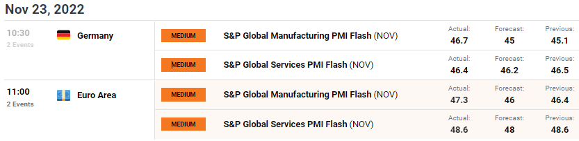
German PMI’s laid the pathway for eurozone data (see economic calendar below) which beat estimates on both services and manufacturing prints. Although the region remains in contractionary territory, the rate of decline was slower than predicted due to softer inflationary forces impacting input prices with regards to the manufacturing sector leading to moderated selling prices.

EUR/USD ECONOMIC CALENDAR

image1.png

Unfortunately for the euro, the data beat was not enough to deter the bearish sentiment around the euro including recessionary risks as well as the inability by ECB hawks to support a 75bps interest rate hike in the next meeting. The day ahead should provide more volatility for EUR/USD with U.S. data taking center stage.

TECHNICAL ANALYSIS

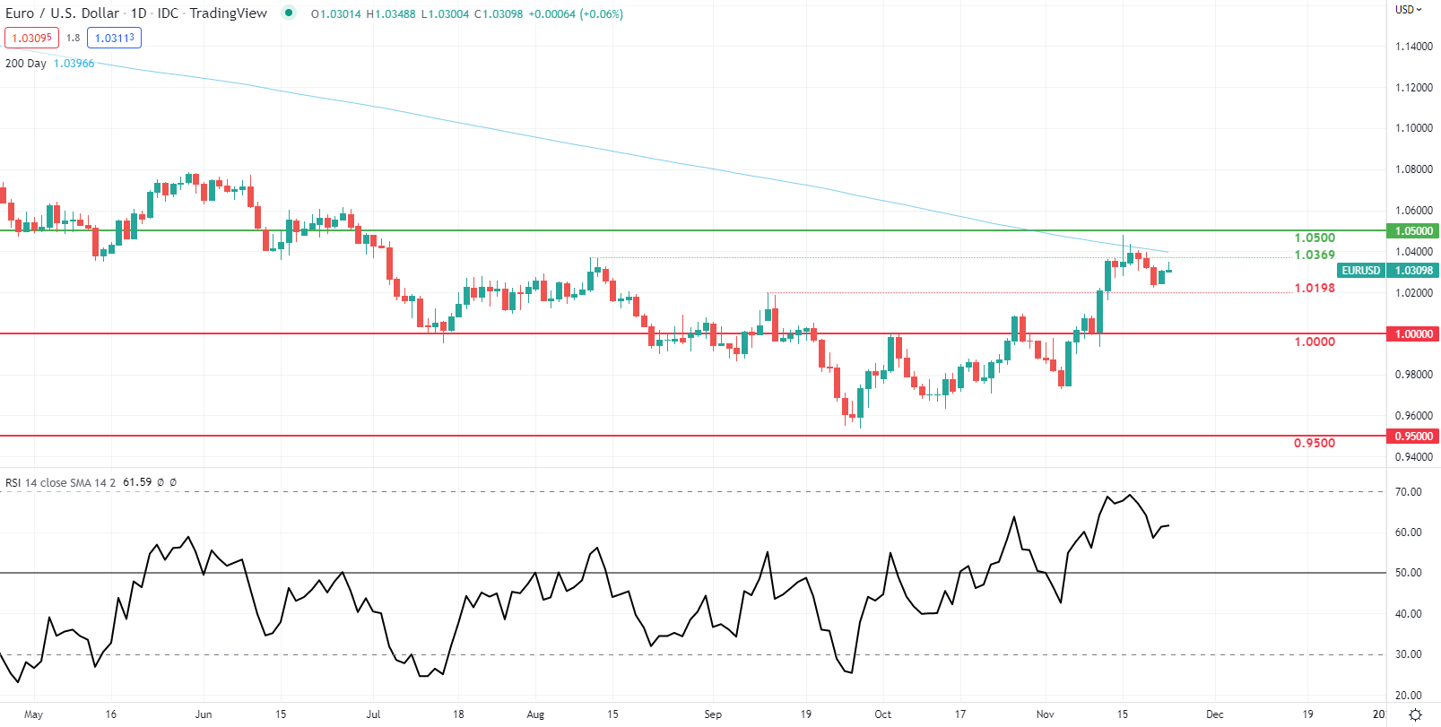
EUR/USD DAILY CHART

image2.png

EUR/USD price action responded negatively to the aforementioned PMI data and currently resembles a long upper wick on the daily candle which could point to subsequent weakness should the candle close in this fashion.

Resistance levels:

  • 1.0500
  • 1.0369

Support levels:

  • 1.0198

US dollar holds firm but on edge ahead of Fed minutes, kiwi rises

SINGAPORE : The U.S. dollar held firm on Wednesday, with investors on tenterhooks before the release of minutes of the Federal Reserve’s latest policy meeting which could offer clues on the outlook for inflation and the pace of interest rate hikes.

The dollar index, which measures the currency against a basket of six counterparts including the yen, the euro and sterling, was last trading at 107.110, having slipped 0.65 per cent overnight.

Carol Kong, a currency strategist at Commonwealth Bank of Australia, said Tuesday’s move reflected better risk sentiment, with stocks and bonds rallying on the back of better corporate earnings and expectations of slower rate hikes from the central bank.

The kiwi rose after New Zealand’s central bank raised interest rates by 75 basis points to a near 14-year high of 4.25 per cent and said the cash rate needed to rise faster than it had previously indicated.

The New Zealand currency spiked to flirt with a three-month high of $0.6207, and was last up 0.47 per cent at $0.6173. The central bank also warned that the economy might have to spend an entire year in recession to bring inflation under control.

In China, a spike in COVID-19 cases has clouded hopes for a swift reopening of the world’s second largest economy.

Shanghai abruptly cancelled an auto industry event on Wednesday, while the city of Chengdu plans to conduct mass testing for residents for five straight days.

“The imposition of new restrictions near-term undoubtedly will have a negative economic impact, but at least for now the market seems to focus on the fact that over the medium term China is looking to gradually move towards a strategy of living with COVID,” said Rodrigo Catril, a currency strategist at National Australia Bank.

“That said, we think that setbacks are very likely in this process, thus we should expect spikes in market volatility along the way.”

The euro rose 0.11 per cent to $1.0313, after gaining 0.6 per cent overnight, while sterling was last trading at $1.1874, down 0.08 per cent on the day.

The Australian dollar fell 0.15 per cent to $0.664.

Cryptocurrencies remained volatile, with bitcoin swinging between losses and gains. It was last up 1.79 per cent at $16,477.

EUR/USD holds steady.

EUR/USD and Sub-$1.02 in the Hands of Private Sector PMIs and the Fed

It is a busy day for the EUR/USD on the economic calendar. Prelim November private sector PMIs for France, Germany, and the Eurozone will be in the spotlight.

After a quiet start to the week on the economic data front, today’s stats will give the markets further guidance on how the Eurozone economy is performing. Growth forecasts for 2023 are unimpressive, and ECB members have started talking about smaller rate hikes.

Know where EUR/USD is headed? Take advantage now with

Trading Derivatives carries a high level of risk to your capital and you should only trade with money you can afford to lose. Trading Derivatives may not be suitable for all investors, so please ensure that you fully understand the risks involved, and seek independent advice if necessary. A Product Disclosure Statement (PDS) can be obtained either from this website or on request from our offices and should be considered before entering into a transaction with us. Raw Spread accounts offer spreads from 0.0 pips with a commission charge of USD $3.50 per 100k traded. Standard account offer spreads from 1 pips with no additional commission charges. Spreads on CFD indices start at 0.4 points. The information on this site is not directed at residents in any country or jurisdiction where such distribution or use would be contrary to local law or regulation.

Weaker-than-expected numbers will pressure the EUR/USD ahead of a busy US economic calendar. Economists forecast the Eurozone Manufacturing PMI to fall from 46.4 to 46.0 and the Composite PMI to decline from 47.3 to 47.0.

However, the markets will also need to consider ECB member commentary. ECB members Luis de Guindos and Edouard Fernandez-Bollo speak today.

Recent ECB member commentary has delivered mixed signals. ECB Chief Economist Philip Lane suggested a smaller rate hike in December, while other ECB members continue to support a 75-basis point interest rate hike. On Tuesday, ECB member Robert Holzmann backed a 75-basis point hike.

EUR/USD Price Action

At the time of writing, the EUR was flat at $1.03034. A mixed start to the day saw the EUR/USD rise to an early high of $1.03049 before easing back.

EUR/USD holds steady.
EURUSD 231122 Daily Chart

Technical Indicators

The EUR/USD needs to avoid the $1.0283 pivot to target the First Major Resistance Level (R1) at $1.0328. ECB member chatter needs to be hawkish, and the private sector PMIs need to beat forecasts to support a breakout session.

In the case of an extended rally, the bulls will likely test the Second Major Resistance Level (R2) at $1.0353 and resistance at $1.04. The Third Major Resistance Level (R3) sits at $1.0423.

A fall through the pivot would bring the First Major Support Level (S1) at $1.0258 into play. However, barring another sell-off, the EUR/USD pair should avoid sub-$1.020. The Second Major Support Level (S2) at $1.0213 should limit the downside. Dovish ECB and hawkish Fed chatter could deliver another sharp pullback.

The third Major Support Level (S3) sits at $1.0143.

EUR/USD resistance levels in play above the pivot.
EURUSD 231122 Hourly ChartLooking at the EMAs and the 4-hourly chart, the EMAs send a bullish signal. The EUR/USD sits above the 50-day EMA ($1.02665). The 50-day EMA widened from the 100-day EMA, with the 100-day EMA pulling away from the 200-day EMA, delivering bullish signals.

A hold above the 50-day EMA ($1.02665) would support a breakout from R1 ($1.0328) to target R2 ($1.0353) and $1.04. However, a fall through the 50-day EMA ($1.02665) would bring sub-$1.02 into play. The 200-day EMA sits at $1.00676.

EMAs remain bullish.
EURUSD 231122 4 Hourly Chart

The US Session

It is a busy day ahead on the US economic calendar. Prelim November private sector PMIs, consumer sentiment, jobless claims, and core durable goods will be in focus. Barring a spike in jobless claims, expect the services PMI and consumer sentiment to have the most impact on the dollar.

Late in the session, the FOMC meeting minutes will also draw attention. FOMC members have delivered mixed signals, leaving the markets uncertain about the December move. While the minutes will provide some guidance, the latest stats continue supporting another 75-basis point rate hike.

Today’s economic indicators and FOMC member chatter could provide more clarity. According to the FedWatch Tool, the probability of a December 75-basis point rate hike stood at 24.2% this morning.

image1.png

New Zealand Dollar Whipped by Jumbo Rate Hike. Will NZD/USD Rally Continue?

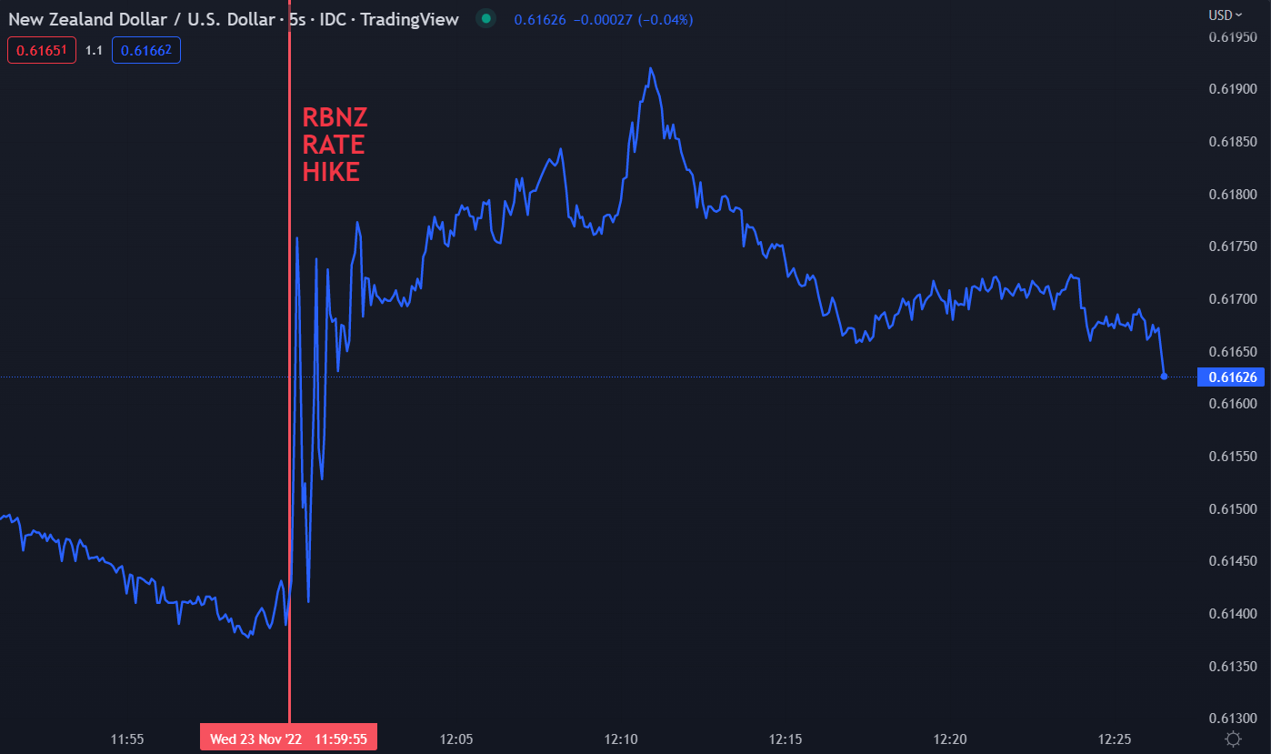
The New Zealand Dollar eventually skipped higher after the Reserve Bank of New Zealand (RBNZ) raised the official cash rate (OCR) target by 75 basis points (bp) to 4.25% from 3.50%.

The initial price reaction was quite erratic before the Kiwi found higher ground as it moved above 0.6190. A move above the recent peak of 0.6206 would make a new three month high.

The jumbo hike was mostly anticipated, with the overnight index swaps (OIS) market pricing in 66 bp prior to the decision. Most economist surveyed by Bloomberg forecast a 75 bp increase, although a minority were expecting 50 bp.

Prior to today’s decision, the RBNZ had raised their official cash rate by 50 bp at five consecutive meetings before this acceleration to 75 bp. This is the first change of this magnitude since the OCR inflation targeting regime was introduced in the 1999.

NZ Inflation is currently running at 7.2% year-on-year to the end of the third quarter. The bank has an inflation target band of 1-3%.

It would seem that the picking up of steam in price pressures pushed the RBNZ to their jumbo hike, after 3Q quarter-on-quarter inflation came in a 2.2%

Additionally, a tight labour market is showing the jobs market being above the RBNZ’s own measure of maximum sustainable level of employment. The unemployment rate remains near multi-generational lows at 3.3%.

The RBNZ said, “Core consumer price inflation is too high, employment is beyond its maximum sustainable level, and near-term inflation expectations have risen.”

With all the heat in the economy, a potential trigger for the outsized hike could be the fact that the RBNZ will not be meeting again for three months, on the 22nd of February 2023.

Of course, the Kiwi Dollar remains susceptible to external factors, not least has been the US Dollar of late with the Federal Reserve on their own inflation fight. The Fed have hiked by 75 bp three times and are anticipated by to lift by 50 bp at their December meeting.

After today’s meeting, the OIS market is now pricing the OCR to be near 6% in August next year, while the Fed is priced to be around 5% for their target rate.

NZD/USD REACTION TO RBNZ RATE HIKE

image1.png

Chart created in TradingView

image1.png

British Pound Pauses as US Dollar Takes Stock of Fed Outlook. Will GBP/USD go Higher?

The British Pound held onto to yesterday’s gains through the Asian session today, with the US Dollar remaining under pressure after Fed commentary.

Remarks from Cleveland Fed President Lorretta Mester and Kansas City Chief Esther George appeared to lead the market to believe that there might be a slowing of the aggressive hawkishness from the Fed.

None-the-less, the market is unchanged in anticipating a 50 basis point lift of their target rate at the Federal Open Market Committee (FOMC) meeting next month. This would be a deceleration from the consecutive 75 bp hikes at the 3 meetings prior.

Elsewhere, the RBNZ accelerated their fight on inflation, adding 75 bp to their official cash rate (OCR) today. NZD/USD was boosted as a result, making it the best performing currency so far on Wednesday.

Another surge in Chinese Covid-19 cases triggered more lockdowns on Wednesday, further undermining equity markets with benign price action despite a strong lead from Wall Street.

The FTX saga continues to play out with a bankruptcy filing in Delaware overnight. Initial findings point toward a substantial amount of assets that are missing or stolen. The court also said that the top 50 creditors will not be named.

Crude oil is barely changed since the North American close with the WTI futures contract near US$ 81 bbl, while the Brent contract is a touch above US$ 88 bbl.

A Japanese holiday appeared to contribute to lacklustre markets ahead of Thursday’s Thanksgiving holiday in the US.

Looking ahead, there are PMI numbers due across Europe, the US and other countries as well as US jobs data. The meeting minutes from the last Fed FOMC meeting will be released later in the day.

The full economic calendar can be viewed here.

 GBP/USD TECHNICAL ANALYSIS

When GBP/USD raced to a high above 1.2000, it broke the upper band of the 21-day simple moving average (SMA) based Bollinger Band. Once the price moved back inside the band, it consolidated sideways.

This type of a move could be a signal of a pause in the bullish rally, or a potential reversal.

Support may lie at the breakpoints of 1.1738 and 1.1646 or at the prior lows of 1.1334, 1.1148, 1.1061, 1.0924 and 1.0354.

On the topside, resistance could at the prior highs of 1.2029, 1.2293 and 1,2333.

image1.png


Forex triangle patterns

3 Triangle Patterns Every Forex Trader Should Know

Forex triangle patterns

– Reviewed by Nick Cawley, August 11 2022

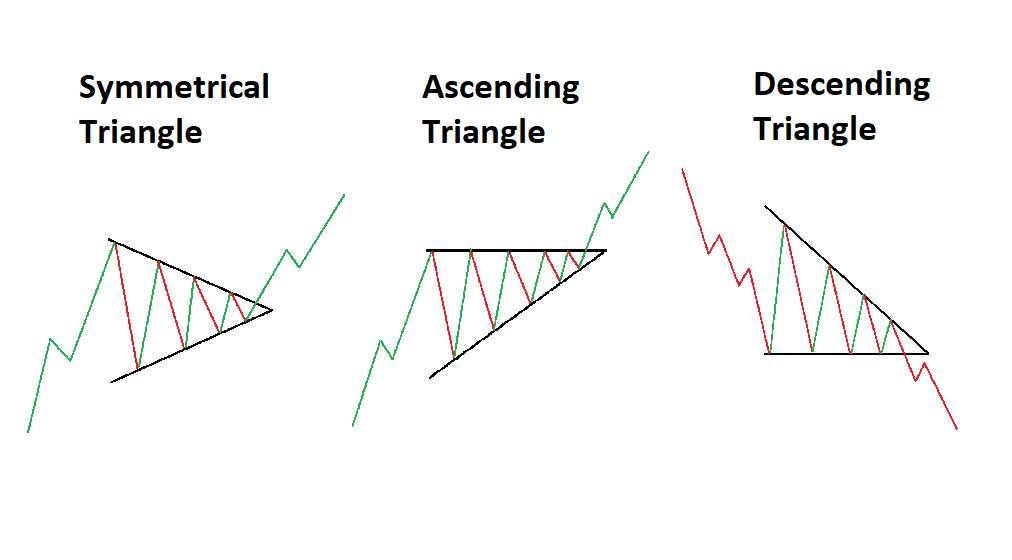
Triangle patterns have three main variations and appear frequently in the forex market. These patterns provide traders with greater insight into future price movement and the possible resumption of the current trend. However, not all triangle formations can be interpreted in the same way, which is why it is essential to understand each triangle pattern individually.

Forex triangle patterns main talking points:

  • Definition of a triangle pattern
  • Symmetrical triangles explained
  • Ascending and descending triangle patterns
  • Key points to remember when trading triangle patterns

Test your knowledge of forex patterns with our interactive Forex Trading Patterns quiz

What is a triangle pattern?

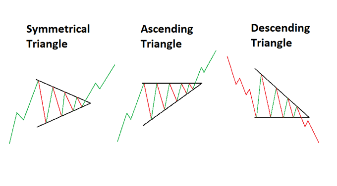
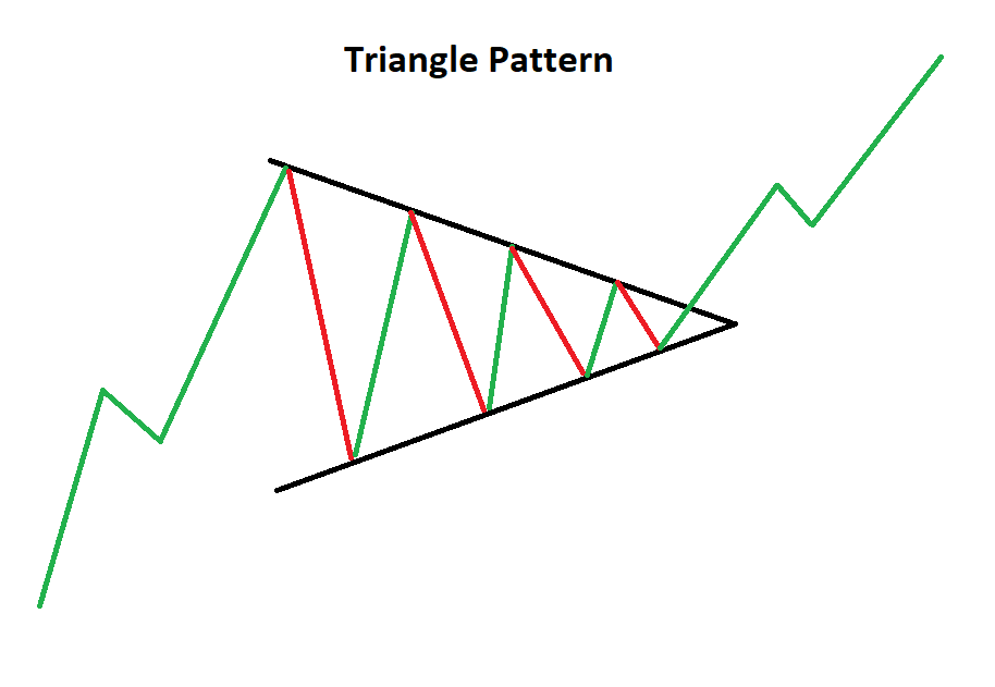
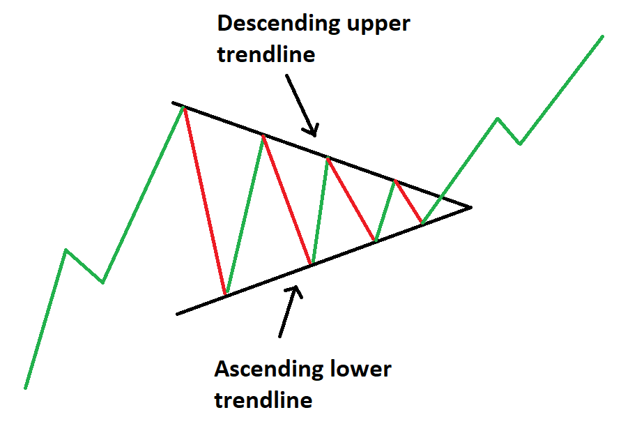
A forex triangle pattern is a consolidation pattern that occurs mid-trend and usually signals a continuation of the existing trend. The triangle chart pattern is formed by drawing two converging trendlines as price temporarily moves in a sideways direction. Traders often look for a subsequent breakout, in the direction of the preceding trend, as a signal to enter a trade.

Triangle chart pattern

This article makes use of line chart illustrations to present the three triangle chart patterns. Traders ought to familiarize themselves with the three technical analysis charts and figure out which one suits them best, although, most prefer using forex candlestick charts.

Symmetrical Triangles

The symmetrical triangle can be viewed as the starting point for all variations of the triangle pattern. As the name suggests, a triangle can be seen after drawing two converging trendlines on a chart.

The difference between the symmetrical and the other triangle patterns is that the symmetrical triangle is a neutral pattern and does not lean in any direction. While the triangle itself is neutral, it still favors the direction of the existing trend and traders look for breakouts in the direction of the trend.

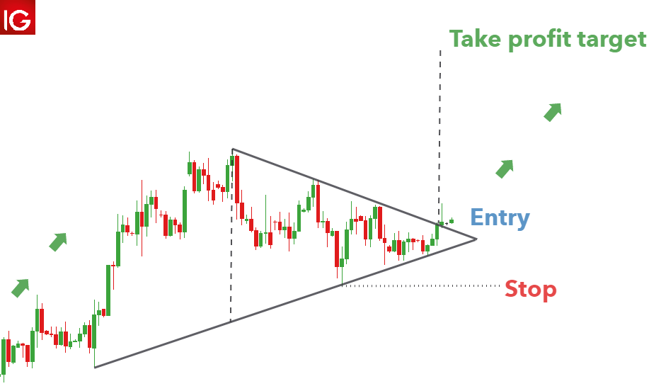
Symmetrical triangle chart pattern

Symmetrical triangle trading strategy

Triangles provide an effective measuring technique for trading the breakout, and this technique can be adapted and applied to the other variations as well.

The AUD/USD chart below shows the symmetrical triangle. The vertical distance between the upper and lower trendline can be measured and used to forecast the appropriate target once price has broken out of the symmetrical triangle.

Its important to note that finding the perfect symmetrical triangle is extremely rare and that traders should not be too hasty to invalidate imperfect patterns. Traders ought to understand that triangle analysis is less about finding the perfect pattern and more about understanding what the market is communicating, through price action.

Symmentrical triangle pattern on forex pair AUD/USD

Ascending Triangle Pattern

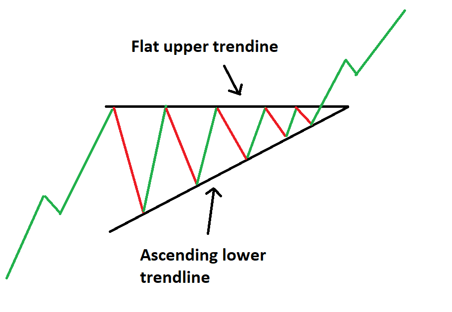
The ascending triangle pattern is similar to the symmetrical triangle except that the upper trendline is flat and the lower trendline is rising. This pattern indicates that buyers are more aggressive than sellers as price continues to make higher lows. Price approaches the flat upper trendline and with more instances of this, the more likely it is to eventually break through to the upside.

Ascending triangle chart pattern

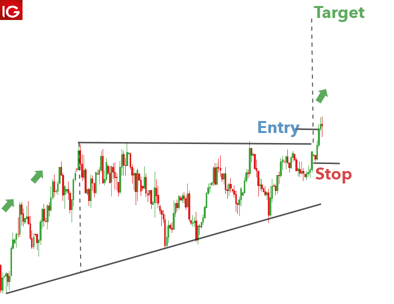
Ascending triangle trading strategy

An ascending triangle can be seen in the US Dollar Index below. Leading on from the existing uptrend, there is a period of consolidation that forms the ascending triangle. Traders can once again measure the vertical distance at the beginning of the triangle formation and use it at the breakout to forecast the take profit level. In this example, a rather tight stop can be placed at the recent swing low to mitigate downside risk.

Ascending triangle US dollar basket

Descending Triangle Pattern

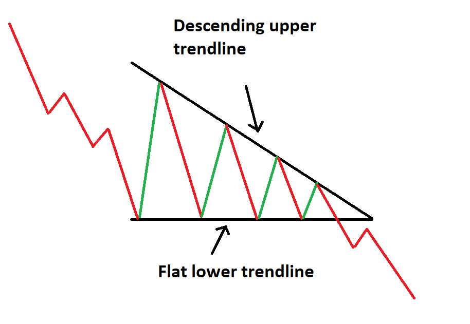
The descending triangle pattern on the other hand, is characterized by a descending upper trendline and a flat lower trendline. This pattern indicates that sellers are more aggressive than buyers as price continues to make lower highs.

Decending triangle chart pattern

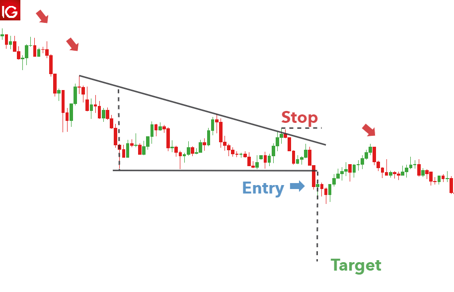
Descending triangle trading strategy

Below is a good example of the descending triangle pattern appearing on GBP/USD. A downtrend leads into the consolidation period where sellers outweigh buyers and slowly push price lower. A strong break of the lower trendline presents traders with an opportunity to go short. In this example, it doesn’t take long for the position to move in the opposite direction, highlighting the importance of setting an appropriate stop level.

The take profit level is set using the vertical distance measured at the beginning of the descending triangle formation.

Descending triangle pattern on GBP/USD

Trading with Triangle Patterns: Key things to remember

  • Always be cognisant of the direction of the trend prior to the consolidation period.
  • Make use of upper and lower trendlines to help identify which triangle pattern is being formed.
  • Use the measuring technique discussed above to forecast appropriate target levels
  • Adhere to sound risk management practises to mitigate the risk of a false breakout and ensure a positive risk to reward ratio is maintained on all trades.

Further Reading on Forex Trading Patterns

U.S. excludes oil for Japan from Russia’s Sakhalin-2 from price cap

Oil from Russia’s Sakhalin 2 energy project bound for Japan will be excluded from facing a price cap the United States will roll out as part of efforts to squeeze Moscow’s revenues for its war in Ukraine, the Treasury Department said in its guidance released Tuesday.

The price cap, which other members of the Group of Seven and Australia have also agreed to introduce, will take effect Dec. 5 for crude oil. Japanese trading firms maintain stakes in the Sakhalin 2 project, which the government sees as an important energy supply source for the resource-poor country.

As for the price cap level, a senior Treasury official said discussions are taking place among members of the European Union before the entire international “Price Cap Coalition” can announce it.

Under the Treasury’s guidance, U.S. persons will be allowed to provide a range of services, including finance, insurance and shipping, for seaborne transportation of Russian oil only if the oil is purchased at or below the price cap.

The price cap application will start when a Russian entity sells crude oil for maritime transport through its first sale to a buyer on land. This means that once the Russian oil has cleared customs in a jurisdiction other than Russia, the price cap does not apply to any further onshore sale.

But if, after clearing customs, the Russian oil is taken back out on the water without being “substantially transformed,” such as by refining, the price cap still applies, according to the guidance.

Exemptions include the maritime transport of crude oil from Sakhalin-2, provided that the product “is solely for importation into Japan,” it said. The authorization for the Russian project will be effective through Sept. 30.

In August, a new operating company for the Sakhalin 2 oil and liquefied natural gas project was launched and Russia has authorized investments by Japanese trading houses Mitsui & Co. and Mitsubishi Corp.

Russia accounted for around 3.6 percent of total Japanese oil imports last year, according to government data.

The G-7 consists of Britain, Canada, France, Germany, Italy, Japan and the United States plus the European Union.

image1.png

Euro Price Action Setups: EUR/USD, EUR/JPY, EUR/GBP

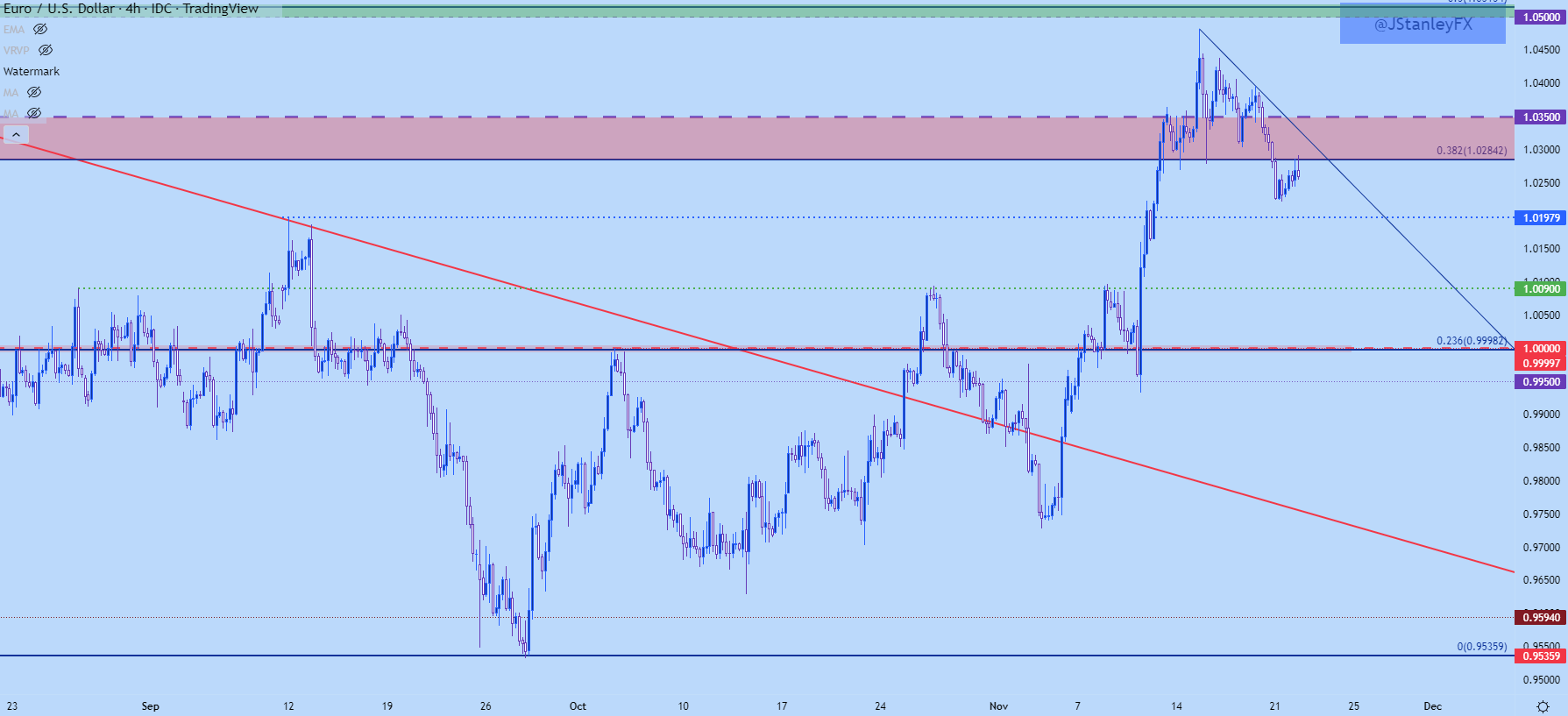
Has EUR/USD topped? I asked that question last Thursday and since then there’s been a continued build of evidence that this may be the case. This week opened with a push below a key area of support with EUR/USD setting a fresh weekly low, which happened as price was breaking below the 1.0282 Fibonacci level that had twice helped to set support last week.

EUR/USD tested through 1.0250 but didn’t quite make it down to the next area of support at 1.0197 before finding a bounce, and that bounce has since pushed right back into possible resistance at that prior spot of Fibonacci support.

EUR/USD Four-Hour Chart

image1.png

As I had looked at in this week’s tech forecast for the USD, there was a symmetrical triangle in EUR/USD which, in an of itself doesn’t carry a directional bias. If meshed up with the prior move, however, an argument could be made for a bull pennant – but for that to remain alive buyers would need to defend support from the formation’s lower trendline – and that did not happen as prices broke down to start this week.

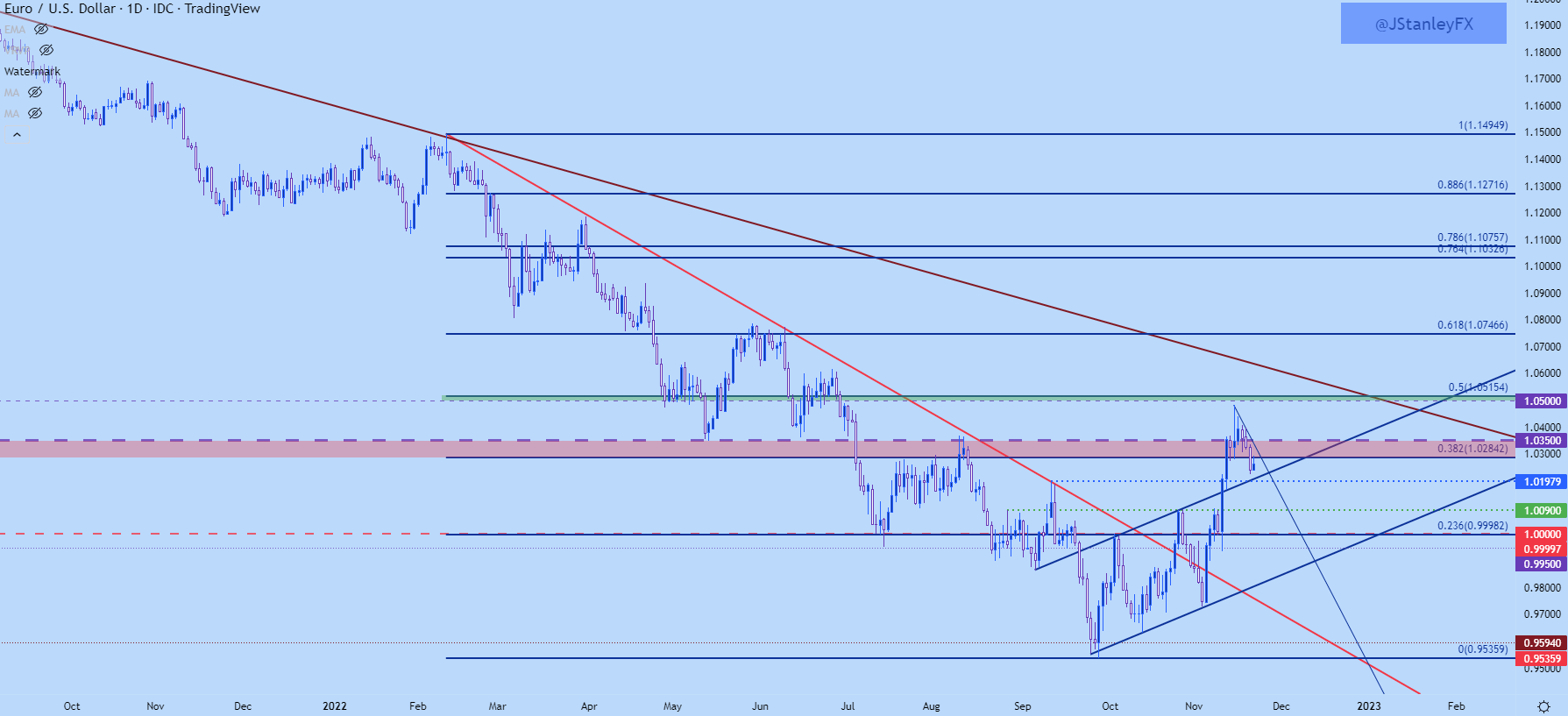
This can keep the focus on bearish scenarios until either resistance is broken or a more solid area of support comes into play. Sitting below current price action is the 1.0175-1.0197 zone, and below that is the 1.0090 level that set the October monthly high.

If sellers can even take out that area, we’re back in the parity box which I’m stretching down to the .9900 handle. If this comes into play before the end of the year it’ll be a massive test for Euro bears.

 EUR/USD Daily Chart

image2.png

EUR/USD Big Picture

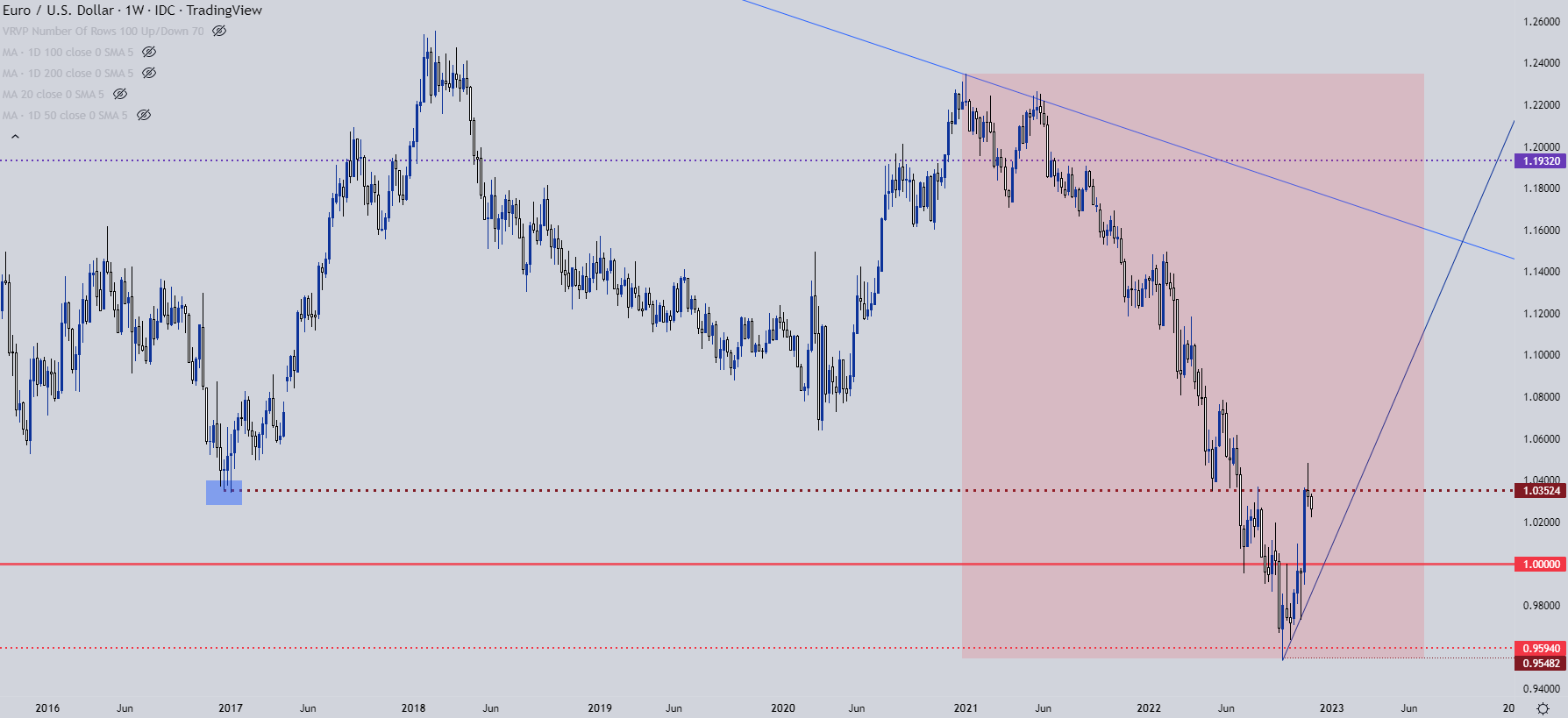
This is worthy of inclusion given its importance on the shorter-term matter but, from the weekly chart of EUR/USD we can see where the pair put in a strong reaction at a key spot last week of 1.0350. The pullback that we’ve seen thus far may be reignition of the bearish longer-term trend after a quick respite. But – it may also be the pair working on a longer-term bottom and all that we’d need to further feed that argument is some element of higher-low support taking-hold ahead of the parity level again, and this is why that 100 pip zone from .9900-1.0000 is so important right now.

EUR/USD Weekly Chart

image3.png

EUR/JPY

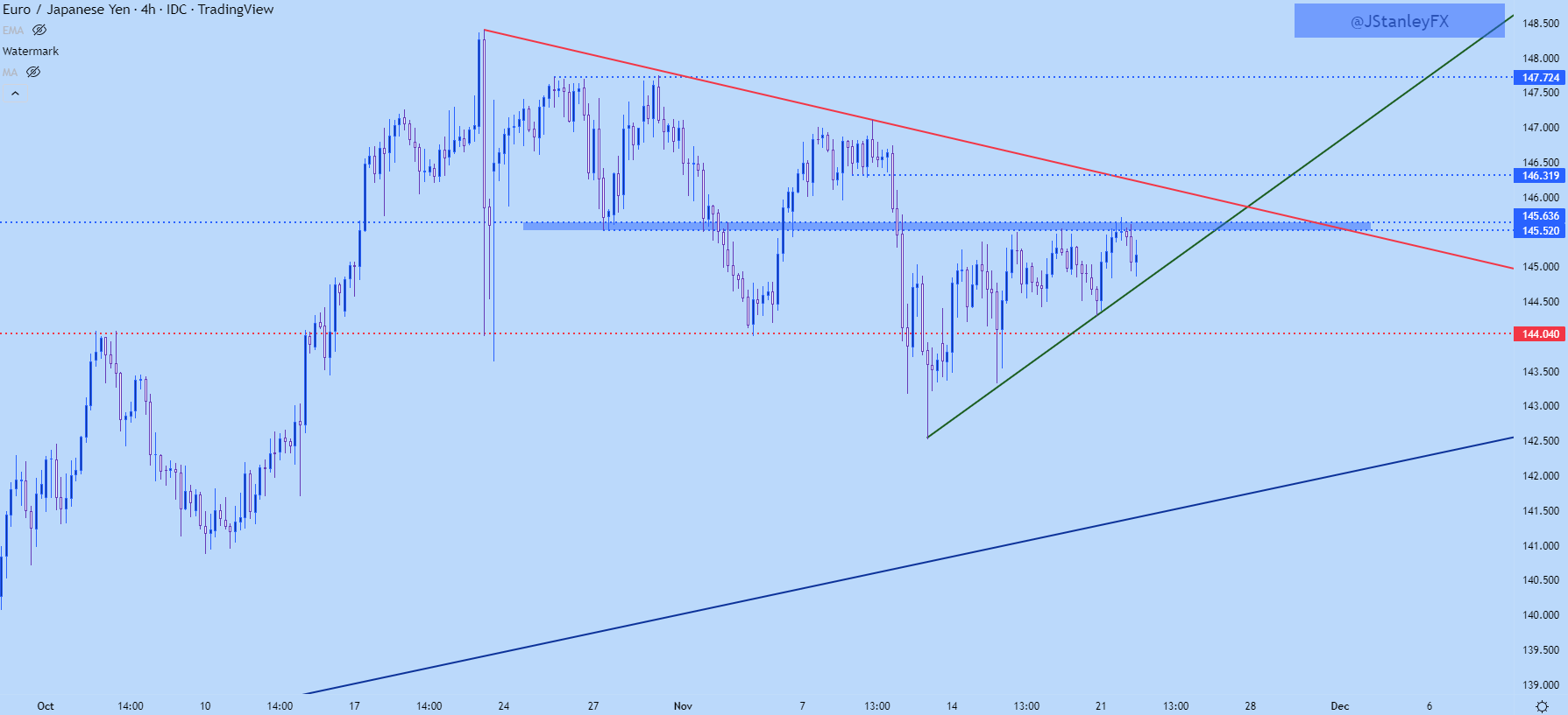
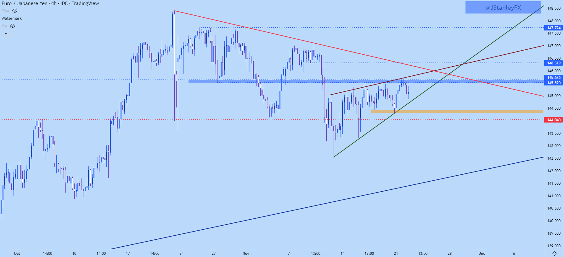
I had looked into EUR/JPY yesterday and the contrast between USD/JPY and GBP/JPY versus EUR/JPY was noticeable. While USD/JPY and GBP/JPY had already started short-term bullish breakouts, EUR/JPY was holding below a key spot of resistance, plotted at 145.52-145.64. This zone came into play again yesterday and it similarly produced a turn in the pair, although that turn hasn’t yet led to a lower-low in EUR/JPY.

EUR/JPY Four-Hour Chart

image4.png

EUR/JPY Triangle or Wedge?

Triangles and wedges may look similar and I’ll even see the two formations often get mixed up by technical analysts; but the way that they are approached is very different. And sometimes, both formations can be justified and this makes proper identification near-impossible until it’s too late.

There’s a similar setup in EUR/JPY at the moment. There’s the horizontal resistance that’s remained in-play around 145.62-145.64 and that’s helped to hold the highs. There’s also a clear bullish trendline at support, helping to demarcate the lows.

So, if we take just that, there’s an ascending triangle – and that formation is often approached with the aim of bullish breakouts.

However – there’s been a build of slightly higher-highs leading into and existing around the test of that resistance, so a resistance trendline can be drawn atop price action and this too could be justified. But, at that point, we now have a rising wedge – which is approached in the exact opposite manner of the ascending triangle above, instead with traders looking for bearish breakdowns in the pair.

So, what is a trader to do when the formation is unclear?

One option is to wait…

Because if that initial breakout is going to lead into a trend, the trader doesn’t have to capture the very first move – they can allow the break to happen after which they look to trade the fresh trend after the break. And given context, there’s usually some nearby levels to use for such a purpose.

In the case of EUR/JPY, traders can wait for either a bearish or bullish break, and when that pulls back, can look to find higher-low support at prior resistance or lower-high resistance at prior support. And traders can incorporate other levels, too, such as I highlighted yesterday with the 144 level in EUR/JPY. So, bears can look to a breach of that level to signal bears’ willingness to extend the trend, after which they look to work the pullback off of lower-high resistance at an area such as 144.50. And on the top side, resistance is fairly well-defined, so if bulls can force a break, that becomes an area to look for higher-low support with the aim of bullish continuation.

EUR/JPY Four-Hour Price Chartimage5.png


A red and a blue candlestick with open and close wicks

How to Read a Candlestick Chart

Reading candlestick charts – Talking points:

  • Candlestick charts differ greatly from the traditional bar chart
  • Traders generally prefer using candlestick charts for day-trading because they offer an enjoyable visual perception of price
  • It’s important to understand the key components of a candle, and what they indicate, to apply candlestick chart analysis to a trading strategy

What is a candlestick chart?

A candlestick chart is simply a chart composed of individual candles, which traders use to understand price action. Candlestick price action involves pinpointing where the price opened for a period, where the price closed for a period, as well as the price highs and lows for a specific period.

Price action can give traders of all financial markets clues to trend and reversals. For example, groups of candlesticks can form patterns which occur throughout forex charts that could indicate reversals or continuation of trends. Candlesticks can also form individual formations which could indicate buy or sell entries in the market.

The period that each candle depicts depends on the time-frame chosen by the trader. A popular time-frame is the daily time-frame, so the candle will depict the open, close, and high and low for the day. The different components of a candle can help you forecast where the price might go, for instance if a candle closes far below its open it may indicate further price declines.

Boost your chart patterns expertise with our interactive quiz!

Our Forex Trading Patterns Quiz will test your knowledge of some of the most important trading patterns. Take the test today by clicking on the link and raise your technical analysis game!

Interpreting a candle on a candlestick chart

The image below represents the design of a typical candlestick. There are three specific points (open, close, wicks) used in the creation of a price candle. The first points to consider are the candles’ open and close prices. These points identify where the price of an asset begins and concludes for a selected period and will construct the body of a candle. Each candle depicts the price movement for a certain period that you choose when you look at the chart. If you are looking at a daily chart each individual candle will display the open, close, upper and lower wick of that day.
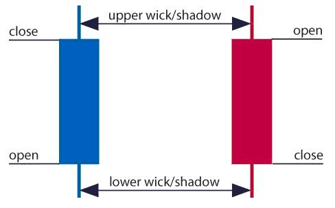
A red and a blue candlestick with open and close wicks

Open price:

The open price depicts the first price traded during the formation of the new candle. If the price starts to trend upwards the candle will turn green/blue (colors vary depending on chart settings). If the price declines the candle will turn red.

High Price:

The top of the upper wick/shadow indicates the highest price traded during the period. If there is no upper wick/shadow it means that the open price or the close price was the highest price traded.

Low Price:

The lowest price traded is the either the price at the bottom of the lower wick/shadow and if there is no lower wick/shadow then the lowest price traded is the same as the close price or open price in a bullish candle.

Close Price:

The close price is the last price traded during the period of the candle formation. If the close price is below the open price the candle will turn red as a default in most charting packages. If the close price is above the open price the candle will be green/blue (also depends on the chart settings).

The Wick:

The next important element of a candlestick is the wick, which is also referred to as a ‘shadow’. These points are vital as they show the extremes in price for a specific charting period. The wicks are quickly identifiable as they are visually thinner than the body of the candlestick. This is where the strength of candlesticks becomes apparent. Candlesticks can help traders keep our eye on market momentum and away from the static of price extremes.

Direction:

The direction of the price is indicated by the color of the candlestick. If the price of the candle is closing above the opening price of the candle, then the price is moving upwards and the candle would be green (the color of the candle depends on the chart settings). If the candle is red, then the price closed below the open.

Range:

The difference between the highest and lowest price of a candle is its range. You can calculate this by taking the price at the top of the upper wick and subtracting it from the price at the bottom of the lower wick. (Range = highest point – lowest point).

Having this knowledge of a candle, and what the points indicate, means traders using a candlestick chart have a clear advantage when it comes to distinguishing trendlines, price patterns and Elliot waves.

Bar Chart vs Candlestick Chart

As you can see from the image below, candlestick charts offer a distinct advantage over bar charts. Bar charts are not as visual as candle charts and nor are the candle formations or price patterns. Also, the bars on the bar chart make it difficult to visualize which direction the price moved.
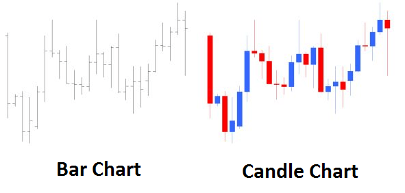
Difference between bar chart and candle chart

Forex for Beginners

Forex for Beginners
Recommended by David Bradfield
From margin to leverage and more: Key concepts explained
Get My Guide

How to read a candlestick chart

There are various ways to use and read a candlestick chart. Candlestick chart analysis depends on your preferred trading strategy and time-frame. Some strategies attempt to take advantage of candle formations while others attempt to recognize price patterns.

Interpreting single candle formations

Individual candlesticks can offer a lot of insight into current market sentiment. Candlesticks like the Hammer, shooting star, and hanging man, offer clues as to changing momentum and potentially where the market prices maytrend.

As you can see from the image below the Hammer candlestick formation sometimes indicates a reversal in trend. The hammer candle formation has a long lower wick with a small body. Its closing pricing is above its opening price. The intuition behind the hammer formation is simple, price tried to decline but buyers entered the market pushing the price up. It is a bullish signal to enter the market, tighten stop-losses or close out a short position.

Traders can take advantage of hammer formations by executing a long trade once the hammer candle has closed. Hammer candles are advantageous because traders can implement ‘tight’ stop-losses (stop-losses that risk a small amount of pips). Take-profits should be placed in such a way as to ensure a positive risk-reward ratio. So, the take-profit is larger than the stop-loss.
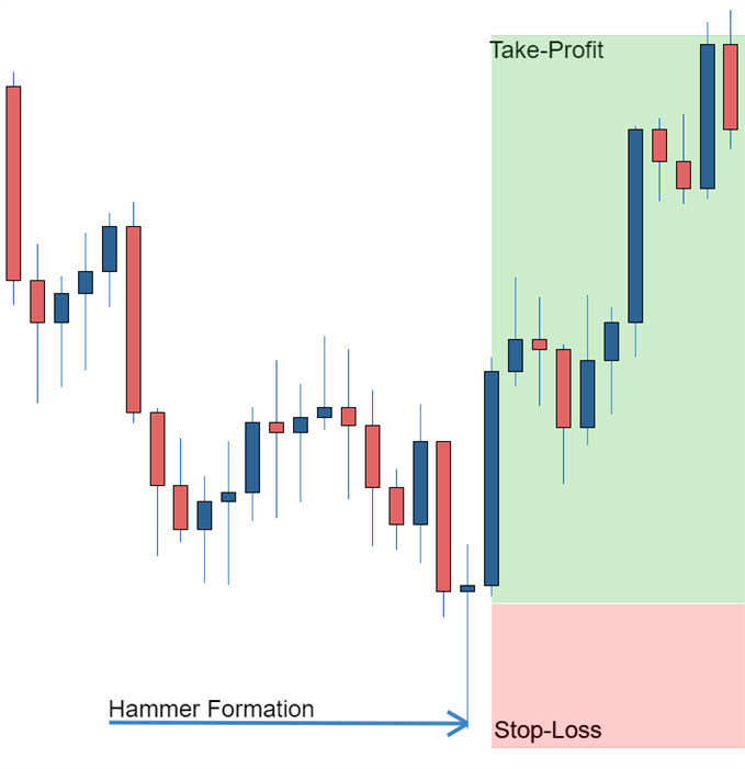
Hammer formation showing stop loss

Recognizing price patterns in multiple candles

Candlestick charts help traders recognize price patterns that occur in the charts. By recognizing these price patterns, like the bullish engulfing pattern or triangle patterns you can take advantage of them by using them as entries into or exit signals out the market.

For example, in the image below we have the bullish engulfing price pattern. The bullish engulfing is a combination of a red candle and a blue candle that ‘engulfs’ the entire red candle. It is an indication that it could be the end of a currency pairs established weakness. A trader would take advantage of this by entering a long position after the blue candle closes. Remember, the price pattern only forms once the second candle closes.

As with the hammer formation, a trader would place a stop loss below the bullish engulfing pattern, ensuring a tight stop loss. The trader would then set a take-profit. For more forex candlestick charts check our forex candlesticks guide where we go in depth into the advantages of candlestick charts as well as the strategies that can be implemented using them.
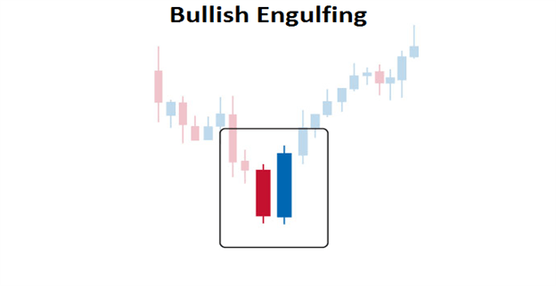
Bullish engulfing pattern

Further tips for reading candlestick charts

When reading candlestick charts, be mindful of:

At DailyFX we offer a range of forecasts on currencies, oil, equities and gold that can aide you in your trading. It is also worth following our webinars where we present on a variety of topics from price-action to fundamentals that may affect the market.